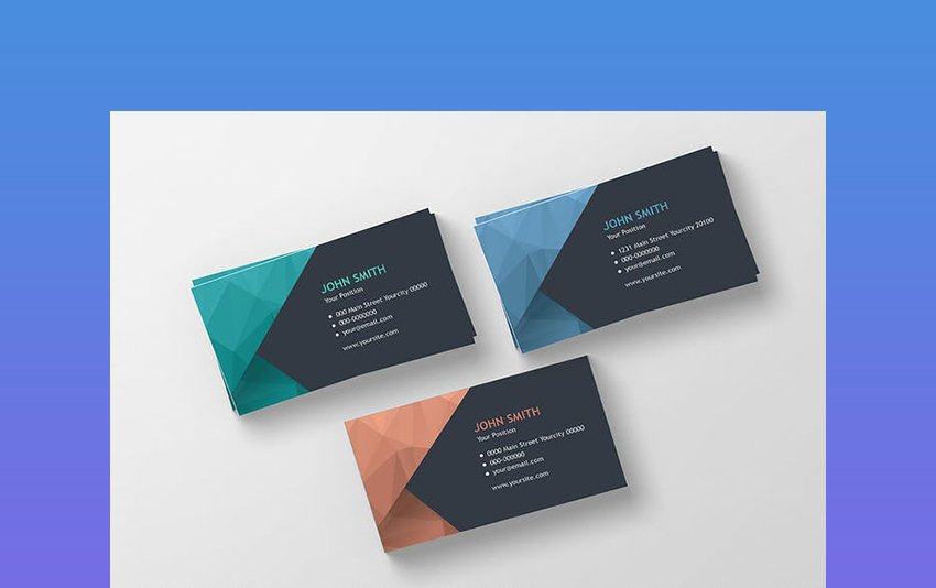
Creating a business card professional design can be a fun project but is also an excellent way to get yourself thinking about who you are and what you are offering for others. Knowing what your brand is, will be an awesome step towards designing a business card that ideally represents you.
There are some things to remember as you design your business card to give a great, comprehensive image of who they are meeting.
Essential Elements of Business Card
Let’s start the process of designing an effective business card.
Get in proper shape
The options are countless when it comes to the shape you select for your business card.
Rectangular-sized business cards are the standard, and there is nothing wrong with selecting that.
Round cornered business cards are distinct in appearance and function. They hold up a bit better than square-cornered business cards because their edges don’t easily fold over. The rounded shape is also more friendly-looking, as they exactly take the edge off of the business card.
Square business cards are another good way to make an impact against the standard rectangle.
So, we have covered the basic shapes: circles, squares, and rectangles. Very exciting. Do you want to ramp it up? Think about die-cutting.
Die-cutting of a business card is cutting it up like a cookie cutter to make the actual shape you want. Stencil out your name and shape your card. There is no limit in creativity here.
A suitable size
Proficient designers can get a little crazy with their sizes and shapes.
Whatever size you select, there are few things to look out for if you want your printing process to go as smoothly as possible. Following are three elements to keep in mind as you are creating a business card professional design.
- Safety line: Anything outside this line is at risk of being cut when you are trimming your business cards after printing. Any important elements such as images or text need to be kept within this line.
- Trim line: The trim line signify the exact size that your business card will have.
- Bleed area: This part of the business card is what will most likely be removed. Don’t place any essential elements in the bleed area. However, if you want your image parts to go to your card’s edge, extend them as far as possible to ensure that there is no space between the image and your card’s end.
There is no actual measurement for these safety elements because the space amount depends on the printer as well as the tool used to trim down the business card after printing. Thus, the bleed can be of any width, but ⅛” (3.175 mm) is standard.
Include your logo
You should include a logo on your business card. It is a way to translate your identity and values into a visual for others to identify. It is believed widely that the logo must be the spotlight of your business, but that does not mean you can’t add other images.
No matter how many times you place your logo or where you place it, ensure it is on your business card at least once.
Include the important elements
When you meet someone immediately at a networking event and want to provide them with your information, what information you will provide? Here is the list.
- Your name
- Your company
- Your job function
- Your email and phone number
- Your website
- Color
The colors you choose for your business card should be suitable to the brand you are embodying. Remember the color psychology as you are deciding these colors.
If you already have a pre-existing color scheme of the brand, keep that nearby. Pick colors for your text and your business card that go well with each other and stick to your brand. Play with contrast and ensure you don’t have dark text on a dark background or light text on a light background.
Don’t forget the color mode (RGB and CMYK), as it is something you should pay attention to when creating your business card’s professional design.
Typography
Now take the above information, make it attractive, and put it on your card.
Working with typography may be tricky. No matter, what your occupation is, a business card is not the correct place to step outside of the box when it comes to choosing your font. Ensure your text is not only easily readable but is pleasant to the eye.
- Sans serifs are easy to read because they are simple. Their lines are straight and clean, without any extra decoration.
- Serifs are also simple but have a little decoration bar at the end of every letter, which makes it less easy to see.
- Specialty and script fonts are used rarely. These fonts are extremely hard to read and can be unpleasant to see. Unless it aligns with your brand, it is good to avoid these on a business card.
Hopefully, a small visualization can help you look at what happens when you get a little bit too excited about typography. So, keep it simple.


